


There was a time when a concept car was allowed to be ridiculous.
It could have doors that opened like theatre curtains, a roofline drawn with a ruler, wheels large enough to fit on a tractor and an interior designed for someone with the flexibility of a gymnast and no luggage. Concept cars were motor show fireworks which asked one simple question: What if?
The latest crop of high-profile automotive statements feels different. Jaguar’s Type 00, Ferrari’s Luce and Audi’s Nuvolari are not just provoking arguments about beauty. They are exposing a deeper discomfort: why do so many future-facing cars now seem to borrow their visual language from consumer electronics?
It is an easy criticism to make. Smooth surfaces, reduced detailing, sealed grilles, and light bars. Lounge-like interiors with touchpoints that seem more Cupertino than Coventry. The car, once the ultimate mechanical object, now appears to be borrowing from phones, speakers, tablets and luxury appliances.
A lazy conclusion could be that electric vehicles have made car design boring. I think the more interesting perspective is that electric vehicles have removed many of car design’s old props.
The old language of speed
For over a century, the emotional vocabulary of the car was tied to visible mechanical drama. Engines needed air, so grilles had meaning; exhausts made noise, so the rear of the car had menace; bonnets stretched forward because something substantial lived beneath them. Even someone with little interest in cars could read the design intent: speed, power, luxury, aggression, elegance, utility.
Electric cars disturb that language. Batteries disappear into floors and motors hide near axles. Software does more of the magic but offers less for the eye to hold. Performance becomes instant, silent and oddly invisible. So, designers reach for new signals: lighting signatures, sculptural mass, digital surfaces, cabin rituals, and brand theatre.
When the symbols stop working
Jaguar Type 00 is a useful example because it isn’t merely a car concept. It’s a brand flare launched into the fog. Jaguar’s “Copy Nothing” philosophy is admirable because the company clearly understood that an electric Jaguar could not simply be a quieter version of an old Jaguar. The Type 00 is long, severe, dramatic and deliberately divisive. It does not want to reassure; it wants to redefine.
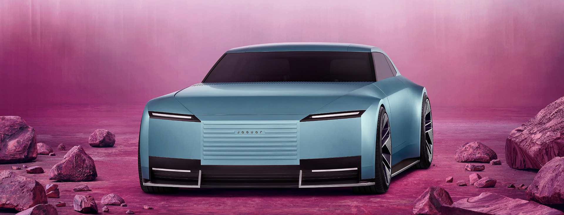
Jaguar Type 00 | © Jaguar Land Rover
This presents a challenge: radical change creates a usability problem long before anyone sits in the seat. People need to understand what kind of promise a product is making. With Type 00, the public reaction was about more than the styling, it was about recognition. Is this still Jaguar? Is elegance now allowed to look this architectural? Can a brand built on grace and British glamour become something closer to a design object than a machine?
Ferrari Luce makes the issue sharper still. Ferrari moving into electric vehicles was always going to be culturally awkward when so much of the brand has lived in sound, heat and theatre. Electrification changes the ritual.
The involvement of Jony Ive and Marc Newson through LoveFrom makes the “Ferrari as consumer electronics” critique almost unavoidable. While it is tempting to ask whether the Luce looks too much like a device, far more interesting is whether it recognises what must replace the old emotional cues.
In a combustion Ferrari, the interface is partly mechanical: the car feels alive before you study the dashboard. In an electric Ferrari, interaction and feedback must carry more weight. That is why the debate around tactile controls matters. A touchscreen can be elegant in a pocket, but in a moving vehicle even the most beautiful menu is a problem if it draws your eyes from the road.
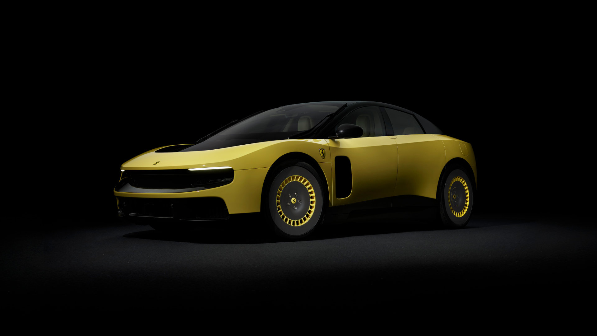
Ferrari Luce | © Ferrari S.p.A.
The comfort of looking backwards
The current appetite for ‘restomods’ is revealing too. Cars such as the Kimera EVO37 look wonderful because they give us the future in a language we already speak: old rally proportions, mechanical drama, automotive mythology, rebuilt with carbon fibre, modern performance and exquisite craft. There is nothing wrong with that; it proves how deeply legibility matters.
But restomods are, by nature, backward-looking. However beautifully executed, they polish previous glories rather than inventing the symbols of the future. They are emotionally fluent because the audience has already learned the grammar. The real challenge is to make tomorrow feel just as readable.
Audi’s Nuvolari offers a different lesson. The original 2003 Nuvolari concept was old school in its appeal: grand touring proportions, visible performance intent and a clear link to future Audi design language. The new Nuvolari belongs to another age: hybrid power, extreme performance, and active systems. Here again, the concept car has changed role. It is no longer only a sketch of a possible future, it is a credibility machine for a brand fighting to stay relevant.
Across these examples, the same friction emerges: the future is technically impressive, but is it emotionally legible?
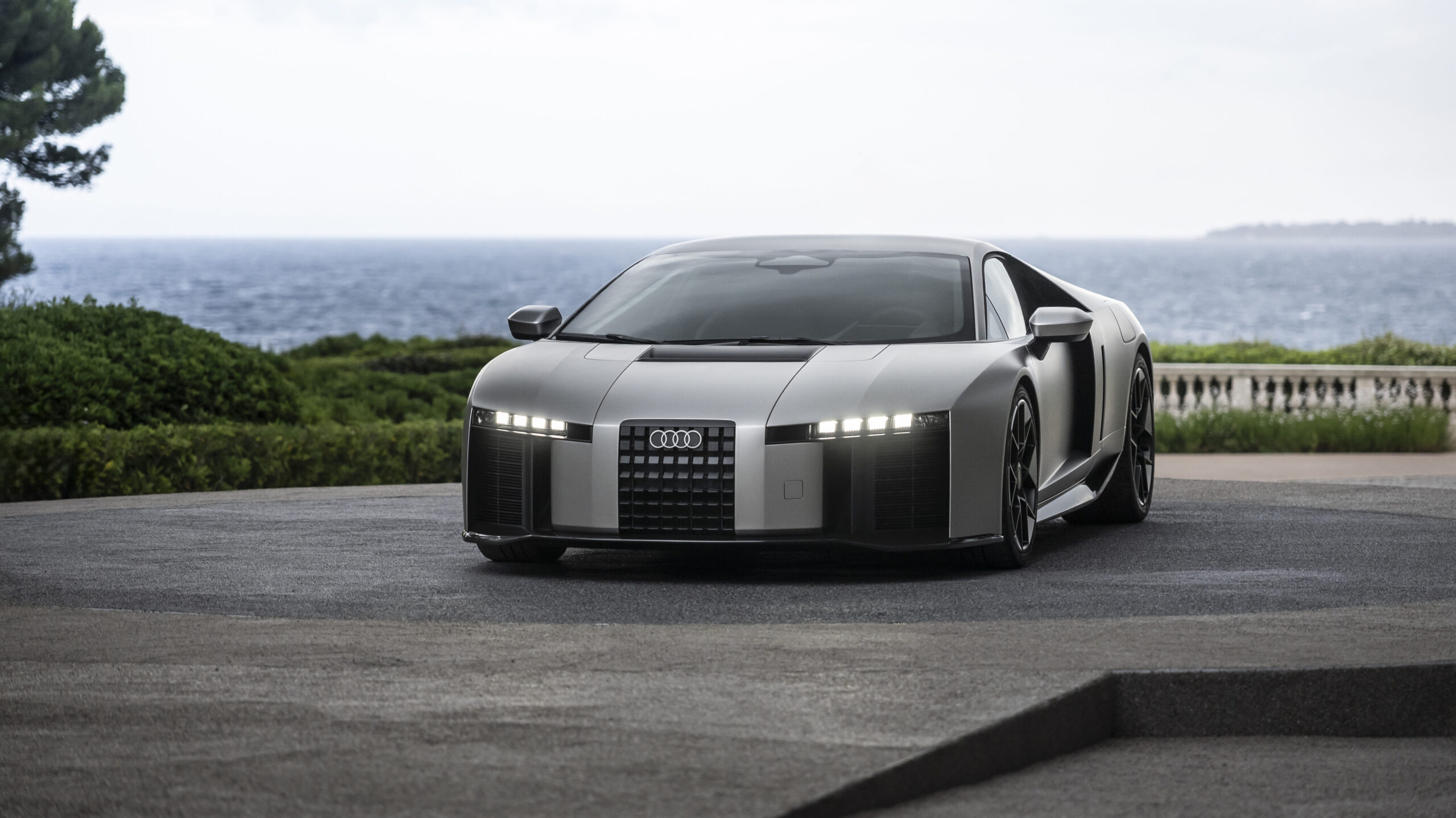
Audi Nuvolari | © AUDI AG
Usability as strategy
This matters far beyond cars. At 42T, we often work in areas where advanced technology, user behaviour, engineering reality, and commercial pressure all meet in the same small room and argue over the biscuits. Medical devices, connected products, industrial systems, and consumer health technologies all face a version of this same challenge. The more capable the technology becomes, the more carefully the human experience must be designed.
This is where usability is too often misunderstood as the polite tidying up that happens after the exciting design work. It is not merely buttons, labels and instructions for use. At its best, usability is strategic; it asks whether people can understand the product, trust it, recover from mistakes, form the right expectations, and build confidence over time.
That is as true for a drug delivery device as it is for a new EV. If the product is technically brilliant but behaviourally awkward, the brilliance leaks away. If it needs constant explanation, it has not yet finished communicating. If it looks advanced but feels uncertain in use, people experience that uncertainty long before they appreciate the innovation.
This isn’t really about whether the cars of the future should look more like the cars of the past. This is about whether new design languages can make new technology feel desirable, understandable, and trustworthy.
Concept cars used to inspire because their promise was immediately readable. Today, some concepts ask us to decode a brand strategy before we feel anything at all.
That may be the heart of the discomfort.
The next great concept car may not be the one that looks most futuristic. It may be the one that makes the future easiest to trust.
Images are official press photographs reproduced courtesy of the Jaguar, Ferrari and Audi media newsrooms. They are used for the purpose of criticism and review of the works depicted, with acknowledgement, under sections 30(1) and 30(1ZA) of the Copyright, Designs and Patents Act 1988. All images remain the copyright of their respective owners.
Join the discussion
This article grew out of a lively discussion on LinkedIn about concept cars, usability and the changing language of automotive design. If you have a view, join the conversation on the original post, or get in touch with Andy if you’d like to explore the topic further.

Andy Pidgeon
Director of Medical Technology and Usability
Andy is a seasoned design & usability leader with over 35 years of experience, including 20 years specialising in medical devices and usability. With a BA (Hons) in Product Design from Sheffield Hallam University, he has worked globally across sectors such as consumer, industrial, scientific and medical, delivering innovative solutions for clients like Novartis, BT, Panasonic, BAA and Oxford Instruments.